Showing posts with label Colors. Show all posts

Friday, April 3, 2009

Who's Afraid of Color?

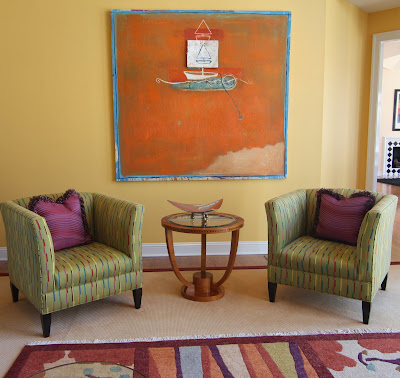
This is one of my more contemporary house designs. I took a transitional Colonial style 1980's house and completely transformed it. I removed the wood mantel and replaced it with this custom designed metal mantel. Ceiling fans were replaced by black wire hung chandeliers and the balcony railings were replaced with stainless steel and copper. This client loved color so I painted the walls a strong color and brought the accent colors in on the pillows, rugs and furniture.

This is the living room:


Crooked ( on purpose ) chandelier in the foyer:


Dining room with purple venetian plater walls: Leslie Blau Stark custom carpet, Donghia chandelier


Master Bedroom: Citrine color walls with accents of black and purple. Check out the headboard with the striped fabric turned in different directions to make a pattern.


Family Room: Rust color leather reclining chairs from La Difference of course!


Matisse inspired laminate breakfast table.

Sunday, October 28, 2007

Tuscany Style Kitchen

When a client asks for a Tuscany Style kitchen, I think of warm colors, rich patterns and textures. This kitchen represents all of those classic elements. Notice the warm stucco finish on the walls with a darker shade of the same color wrapping the barrel vaulted ceiling, honed black granite countertops, the buttercream color of the cabinets, the richly patterned fabrics in earth tones and reds, European Aga Cooker, handpainted frienze work, and the overall inviting feeling.


The artichecture of the room with this dramatic barrel vault was not as prominate in the design until the colors and frieze work were completed. Without the color the room lacked any focal point or warmth. With the help of my favorite faux finisher, Jennifer, we came up with this fantastic result that both the client and I were thrilled about.


Remember to highlight all your most interesting features in the room. Slight changes in color tones can have a spectacular effect. The cabinets, walls and ceiling of this kitchen are all in the same color family but each showcases the next.


This is both a cook's kitchen and a family gathering space. Thanks for sharing time with me and another Bridget Beari Design!

Sunday, September 16, 2007

Make It Work!

I often search for weeks or even months trying to find the perfect item for a room. In this particular case I was looking for a striped pink and taupe fabric for draperies in a client's dining room. The colors were either too bright or too muted.

It was time to come up with another idea. I found the perfect colors in solid fabrics and had the two solid fabrics cut into strips to make the stripe. The effect was perfect. No one can tell that the two fabrics are sewn together. The moral of this story is " Make It Work." There is always a creative way to solve a problem with fantastic results.


Sunday, August 19, 2007

Hot New Color Schemes

I was asked by our local Home Style newspaper to come up with a "hot" new color scheme so I thought I would share my ideas with my blog readers. The new color schemes that I see emerging are metallics, blue greens, orange, acid green and chocolate. The editor asked me to come up with fabrics, carpets, wallcoverings and tiles that represent the acid green and chocolate look. Here are my proposed items:


The wallpaper is from Designer Guild, the geometric wool carpet from Stark, the chocolate sisal from Concepts International, the silk drapery fabric from Jab with a Duralee trim, Carlton V paisley print for upholstery in linen, the stripe for upholstery from Duralee, and Ann Sack tile. Combining these items together woud be the beginning of a great design scheme. I just need the right room to put it in. Maybe that room will come along and I can show you a before and after shot.

Monday, August 13, 2007

How to use orange?


People often ask for colorful rooms. I love to use color but find that painting the walls a strong color does not always give me the look I want. A strong color like orange is better used in accents like draperies or chair covers. The warm vibrant feeling of orange makes the room feel cozy and inviting. The copper faux painted ceiling helps to create a more intimate space. When you think of orange you think of citrus but pairing the orange with coppers, chartreuse and browns tones changes that Miami citrus look.

The texture of the sisal rug, the faux painted vines, ceiling and cabinet work, the orange and chartreuse striped drapery panels, chartreuse geometric pattern on the chair seats create a balanced room. The orange color is prominant but not overpowering. When using strong bold colors in your home, think of the drama and impact those colors will have on the room. Do you want shock and awe or warm and inviting? Sometimes shock and awe is fabulous in a restaurant or hotel. Kelly Whearstler's Maison 140 hotel in Los Angeles has blood orange hotel walls. The sheer funky factor is great!

Color can inspire and delight. Don't be afraid to try the stronger hues like orange.