Showing posts with label anatomy of a room. Show all posts

Sunday, January 15, 2017

Anatomy of a Room - Parisian style


In this series I take rooms I love and break them down into key points that make the room work visually, artistically and architecturally. 

This room is a Parisian apartment designed by interior designer Jean Louis Denoit. He is known for his classic style with a contemporary twist but what I love the most about JLD style is his fearless mixing of patterns and antiques. 

This is why is this living room works so well:
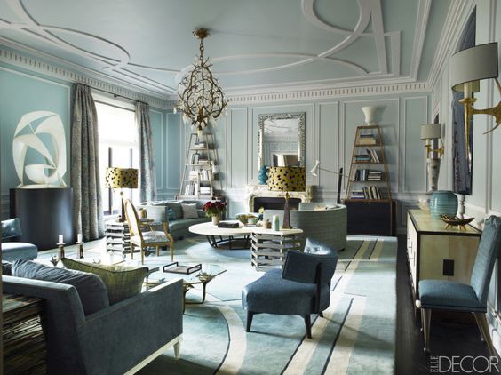

                                               photo - ELLE DECOR

1. Tones of blues
                 He starts this palette with blue tones, light to dark, robins egg to federal blue to black. Repeating the colors with just the right balance in the walls, carpet and ceiling. The stronger accents of black are in the etageres and sculpture bases to anchor the room. He adds gold to warm up the room but soft enough to continue his feminine palette. Just an odd touch of green to mix it up. Nothing is too perfect. He is also not afraid to mix the metals, silver mirror over the mantel with gold etageres, chandelier and sconces. 

2. Scale   
        
               I love his use of over scaled ceiling patterns to match the rug pattern. All the architectural details were added to the room as the apartment was completely gutted. The large molding on the ceiling against the perfectly scaled picture molding on the walls and dental molding. A beautiful contrast. His furniture pieces move throughout the room from high - etageres and sculpture to mid range - lamps and art to low - seating. The seating seems to be all in the same plane. Curves of the sofas balanced against the curves of the chairs. Not to mention how this all relates to the ceiling and carpet curves - brilliant! 


photo ELLE DECOR

3. Antiques with modern pieces

Although many of this pieces are high end, antiques or custom I was surprised to find some Arteriors, Osborne and Little, and Vaughan modern pieces added in. Things that we all can purchase but mixed in they look as expensive as the antiques. Original art and sculpture along side marble carved mantels and mid century lamps. It is a real art to be able to combine elements so beautifully. 

4. Balancing act

The room is symmetrical with 2 lamps, 2 sofas, 2 tables but it does not feel stagnant. By using the 3 pieces of pottery on the back console your eye looks at the green pot then the strong blue small pillow that pulls your eye from the glass sculpture on the wall. The shapes repeat from the circular moldings on the wall to the sculpture over the console and the rectangular picture molding repeats on the sofa flat braid. Different scales but thoughtfully placed. I also love the white accents of trim on the sofa, crystals on the chandelier and moldings. It gives the room a beautiful ice palace effect. 


photo ELLE DECOR

This is one of my favorite rooms of all time. I love studying the pieces- accessories, color, and scale. 

Thank you for reading Anatomy of a Room! Leave me a comment and let me know what you think of Jean Louis Denoit's Parisian apartment. 


Saturday, February 14, 2015

Anatomy of a Room - Kit Kemp Bedrooms


Having just returned from a fabulous trip to Europe, I stayed in some amazing hotels but The Ham Yard Hotel in London captured my attention. 


Designed by Kit Kemp, it is one of the Firmdale hotels that she owns with her husband.  


As my New Years goal is details, this hotel was full of design surprises and curious choices. I loved her layering skills - mixed up, unmatched but not too juvenile or garish. 

Here is her design philosophy from Lonny Magazine: 

"My palette is diverse, but my style is about achieving a balance between what’s colorful and what’s neutral and restful. You need only one really inspiring piece in a room." 

Let's see how she achieves this by examining only the hotel bedrooms. 


This room seems fairly matched up but look at the turquoise stool. The bed comfort level is amazing. Bold pattern on the headboard mixed with the graphic curtain pattern. 

 The next room has a bold wallpaper with marbled headboard fabric and then a multi patterned bench


Then turn to the floral mixed with the yellow topped chairs with decorative flat braid. The artwork is interesting as well - unmatched to the room. 


Grey walls, navy/pink dustskirt, orange red drapery fabric. Brilliantly mismatched


Again pattern upon pattern


Peak and Boo pleats on the dustksirt in contrasting colors. 


Boiled wool was everywhere with contrasting cords and mixed stripes - see the bench


Stripes at the window but larger stripe on the chairs


I just used the fabric on the pillows in a guest room. I mixed it with a brighter blue but here she has mixed with dark navy diamond pattern with the petite floral design and another print on the window. Clever! 


Wow - look at this sofa stripe. It really shows off the room and the art above. The other items in the room are more neutral but still mixed patterns. 


Even bolder here with floral headbaord, medallion bench fabric, striped chairs, and red and blue art work. 


Red and pink striped draperies with a red floral headboard. A lime green bench to break up the hot colors and the neutral gray walls to cool it down and unify the room. Notice the floral on the side of the chair - that technique was everywhere. Even more pattern upon pattern.  


The art was incredible too - perfectly picked and placed. Again mismatched and definitely original.  


I loved the different headboard shapes in each room and how the design in each room is different. It makes me want to go back and stay in a different room. 


Some rooms were simple but the attention to detail was the same - notice the upholstered door! 


Gorgeous bird nest wallpaper and embroidered headboard fabrics - old fashion but at the same time modern. 


Contrast that with a more modern bathroom - clean and sleek


She is master at the mix - her creative choice of fabrics, attention to every detail. It is Brilliant design work! 

Did you notice the dressmaker forms in every room covered the fabrics? 


Next time we will look at the more public room.  You are in for a treat. They are definitely a WOW factor! 


Saturday, July 26, 2014

Anatomy of a Room - #2 Daryl Carter


This is the second post in my series called Anatomy of a Room, where I break down a room to tell you why it works. This week we will showcase Daryl Carter, a DC designer. Daryl's tag line is the "new traditional"but I think he is the master of creating the unexpected in terms of furniture arrangements, mixing of styles and simplicity. 

Look at this living room: 


photo via Elle Decor

What works: 

1. Simple base of black and white

Notice how he white washes the room in white - walls, ceilings, trim even the valances on the windows. This unifies the room. The accents of black - long panels, art, lamp shade and armoire help pull your eye from one side of the room to the other. This makes the room seem warmer. 


2. Mixing furniture styles while keeping fabrics similar in color

Notice the 2 sofas are more of a contemporary style mixed with farm tables, pine coffee tables, planked armoire, Chippendale chairs. The fabrics are similar from piece to piece but the vary in texture from the sofa to the wing chair. Even the sisal rug and hide rugs are of similar color. This technique gives the room a softness in contrast to the black and white. 


photo via Elle Decor

He is such a master at combining styles from animal heads and Early American art, textures of stone bowls against wood grains, black velvet and linen. His style is current but rooms are filled with antiques. It is just a brilliant mix. 

3. Creating two seating arrangements in one long room

This can be difficult for most people but notice how Daryl's sofa choice of 2 low backed sofa doesn't stop the flow but allows the room to function as one. The single sisal rug helps unify the space as well but repeating 2 hides in the individual spaces keeps them separate. There are many pieces in this room but the similar color of even the accessories keeps it from looking too busy. 

photo via Elle Decor

Here is the master mixer himself. 

photo via Elle Decor

I hope you can use some of these tips to work on your own home. 

Until next time.....

Happy Designing 


Sunday, January 26, 2014

Anatomy of a Room


                   This is the first of a new series on the blog called 

                                 " Anatomy of a Room " 


This series was created because I am always asked " how do I figure out what colors or style to put in a room. " or " How do you know things are going to work in a room?" 


I believe that "all good design comes from seeing the potential in every space." I love being creative but it is always the architecture of the house or room that calls forth the design concept. That is not to say that client's likes or dislikes or personal affects don't play a role  - they do and a very big one but I am always lead by the architecture. 

If I pick a favorite room by a well know designer and we break it down to basics, I think we can reveal some secrets of how some room work and why other don't. This may even help you with your own design decisions so here we go….


A beautiful dining space by one of my favorite designers, Jean Louis Denoit. 

The Anatomy of the room - 

a. long and narrow
b. open to 2 other spaces
c. beautiful light through the windows
d. warm wood floor

These are the first impressions one gets if you saw the room without furniture. So you ask yourself how do I enhance these elements of the room so that the room sings! If a, b ,c ,and d are the make up of the body of the room then what is added is the clothes and jewelry. Just like when you dress yourself you want your clothes to complement your body not overwhelm it. 


This room works because the designer: 

a. enhances the length with vertical stripes but uses soft taupe, gray and metallics. The walls are the single focal point even though they are subtle. Everything else works to complement this choice. 

b. leads your eye to the ceiling with the moldings added to the ceiling and the addition of the metallic 

c. complements the other adjacent rooms by using similar colors but the vertical stripes help your eye travel from one room to the next

d. the use of metallics in the stripes and table base and the glass table top plays with the beautiful light coming through the windows

e. by pulling out the gray in the chairs and drapery, the room is softened

f. the jewelry is the rug - contemporary by choice it anchors the room 

g. A black and white piece of art is the perfect. It stands out because the negative space makes it as sophisticated and calm as the room. 

There you have it the Anatomy of a Room. This is one beautiful room! 

Until next time…..


Happy Designing …...


So what did you think of this series? Leave us a comment and we will send you a Bridget Beari Candle for Free!!!!  First 2 people  - WIN!