
A weekly blog series exploring different creatives' views on color and its use in interiors, art and design. We will dive deep into their obsessions with color. How and why they use color. You will get to know their stories and you may even gather some tips for using color in your own home. What is better than learning from the experts!
Designer Spotlight: Regina Sturrock

I love having my designer friends on this Blog series and Regina Sturrock is a special friend from Toronto Canada. She has been a designer for over 20 years and has projects all over the globe. Her firm specializes in highly customized renovations and new builds within the luxury home market. Born in Graz Austria, a city steeped in Old World culture, Regina understands how the human spirit responds to the ideals and beauty of classical design. Her projects are beyond stunning and I am thrilled to hear how she works with colors and light!
Regina Sturrock: I suppose the color that would best represent my design aesthetic is blue. It’s a calming hue that evokes a strong sense of peace and serenity; an essence that speaks to the order and clean classicism in my interiors. If I could see color as a design principal, blue would absolutely distinguish itself with symmetry and harmony. There’s a deep integrity to this hue.

SJ: Do you use color as a dominant role in your designs or as an accent?
RS: Yes, and yes. I love to have color evolve in my interiors and in that process, I often begin with a one-color wrap that plays within the architecture. Whether this color is light and bright or dark and moody, it serves to sculpt the envelope. From there, layers of color can play out as either a monochromatic scheme that continues to compliment the structure or it can make brilliant statements in textiles, art, and accessory. There’s a definitive beauty in an elegant transitioning of the same hue and nothing can be quite as powerful than a large and vibrant masterpiece that holds every color in the rainbow.

SJ: How do you feel about matching colors in a room?
RS:I always like to bring in a bit of tension. It’s amazing what just a hint of unexpected color can do. Imagine a room that falls predominantly within a softened green and yellow palette and then shocking it with a bold touch of fuchsia or throwing a sophisticated black and white mix into the scheme. Taking it a step further, a slightly ‘off’ layer of color (just a small touch) can add spirit and character.
A perfectly matched room can be terribly
boring. I’m not talking about a balanced and monochromatic palette; one that is
inherently interesting within its nuances. It’s the safe and contrived look
that I stay clear of and it’s liberating to allow a bit of the ‘mis-matched’.

SJ: What color represents your personality?
RS: Emerald green. I’m a person who loves to connect with nature. It’s where I find peace, balance, and inspiration. Green is a color that reflects these things, hovering between the optimism of yellow and the calming insightful side of blue.
As a jewel stone, Emerald is associated with the heart. It’s
nurturing and carries an energy of compassion and patience. I like to think
that this aligns with who I am….and it’s my birthstone!

SJ: What color comes to mind when you talk about:
Your favorite City ....... Red: The red oxide roof tops that are bright even on a cloudy day bring me home to Graz, Austria.
The House You Grew Up In ......... Avocado green…in the guise of flocked damask wallpaper!
Last Fabulous Dinner You Had ........ Pink: It was capped off with an unusual, yet somewhat relatable desert of smoked cotton candy served in a stainless-steel tissue holder at my favorite restaurant, Launceston Place, in London.
Your favorite Flower ....... White: I fill my home and studio with white lilies each week. They bring in a pure and fresh beauty.

Your favorite season ...... Yellow: Fall. The last days offer the most intense color. Everything is clear.
Your Favorite Art ...... Gold: Portrait of Adele Bloch-Bauer by my favorite artist, Gustav Klimt

Your Favorite Room in Your Home ..... Lavender: A haven room such as my den is where I relax, read, write, paint and reflect. Often these types of rooms are the smallest and the most precious. Mine has an airy pastel vibe, filled with stacks of books, collected bits of everything, small sprays of fresh flowers, and a hint of lavender always lingers.
Your Favorite Article of Clothing ...... Bottle Green: my silk chiffon polka-dot maxi dress from Barcelona
SJ: Name a color you never use?
RS: There isn’t a color that I would consciously boycott. Any hue is possible depending on the client’s preferences and the atmosphere we’re looking to create. I suppose a less likely color choice would be orange because I find it to be very intense and perhaps overbearing as a predominant theme. But then again it could easily pop up in an art piece. Overall, I prefer more soothing and quieter palettes.
SJ: Name a color you use frequently?
RS: Blue. I love all shades and intensities of this color. The scheme possibilities are endless. I’ve created many different environments using blue from soothing neutral compositions that play with gradient levels of the same hue to very dramatic and luxurious settings of deep cobalt to lapiz lazuli.

SJ: If you could pick a name for a color what would it be?
RS: ‘Rocaille Blush’ My favorite building in Graz, Austria is Luegg Haus in the heart of the old city. The soft-pink stucco façade is ornamented with flourishes of rocaille that look like icing on a fancy cake. It’s a fantasy structure filled with childhood memories….and it houses Swarovski!

SJ: Do you have a pet? What color reminds you of him/her? Do you have a nickname for this pet?
RS: Of course, and his name is Seymour. Absolutely, Cerulean Blue for its calm and reflective qualities. He’s a gentle soul and he’s a thinker. He can stare across the lake forever, it seems. His nickname is ‘Boo Boo’ (sorry can’t help myself…he’s really cute).

SJ: What is the Now Neutral?
RS: I call it an ‘almost neutral’, holding the softest hints of color. Muted pastels; chalky, timeless, gender-neutral shades from blush to lilac grey are very ‘now’. It’s a refreshing tilt away from the greys and particularly effective in a minimalist setting complimented with natural materials or softly-veined marbles.
SJ: What is your prediction for the next big color trend?
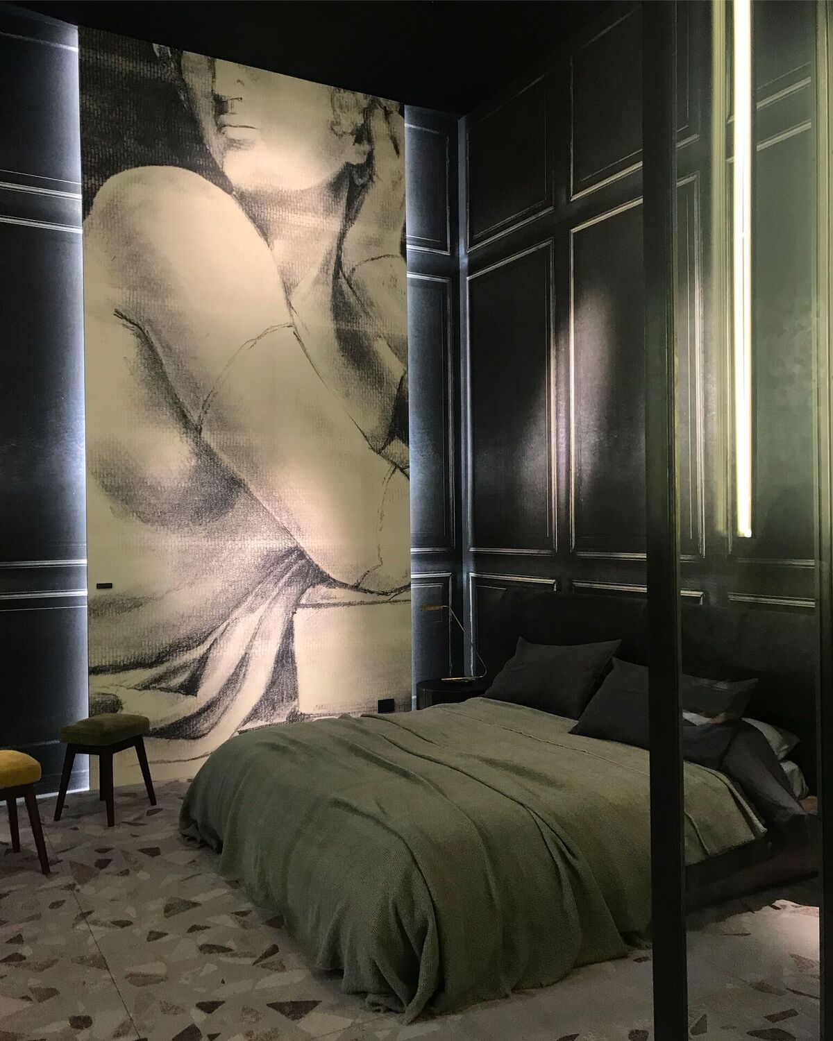
RS: I saw it begin to emerge at Salone del Mobile in Milan, last spring; a strong hinge to a movement that will be fully explored in 2019. A deep and moody character of color was showcased on walls, cabinetry, and even countertops. I knew that it would make a further transition into this year as a true departure from the all-white interior. It’s also a step away from the intensely saturated and vivid hues that recently began to spread wings in the new quest for color. The next big trend is more about the intensity and depth of hue; a rich and settling embrace of color that dips into fully-covered and deeply-muted envelopes. The palette is earthy with a slight urban edge; greens that depart from the arboreal, blues that are almost black and purples that are inherently rich yet slightly mellowed.

SJ: What are the best color combinations?
RS: Ones that bring balance and harmony are the ideal combinations. Often these are inspired by nature. I love to see palettes that one can easily live with; relax to. From this perspective, I typically tend to use analogous combinations of 2 to 3 colors (ones that are adjacent to each other on the color wheel) as the basis for the scheme. Imagine a muted lilac, dark blue, and a misty-grey blue. With this as a grounding, any rich complimentary accent can strike the right chord; like that distant golden glow of the sun’s last rays in a twilight sky.
It’s essential to consider the color space as a three-dimensional impression combining not only hue, but its value (how light or dark it is), and its saturation or chroma. Ultimately, just about any color combination can be beautiful if we balance the three as we do with elements that hold form. It always leads to composition.

SJ: Best advice when it comes to picking paint colors?
RS: Light and color are synonymous. Always consider exposure and the quality of light when selecting a color. How much and what type of natural light fills a room can greatly affect the way a color behaves. This also applies to the color rendering index that interior light sources emit. I often get asked for the color name when I post a project on social media and I answer with a cautionary note because color is not always a cut-and-paste option. It’s a chameleon and animates with light. Bring the color home (paint a small wall section or canvas) and see how it plays on the walls from morning to night. A good color choice goes far beyond matching it with a textile or its appeal in a magazine.
________________________________________________________________

No comments:
Post a Comment