Saturday, March 17, 2012

Bridget Beari Color Rule #20


Bridget Beari Color Rule: 


#20

Start with textiles first!

By textiles I mean a fabric, wallpaper or carpet, I find this is the easiest way to start a room design. That said, it does not mean it is the only way. You can be inspired by anything... a painting, an object or a feeling. 

If you start with a fabric like the ones I will show below, you can pick colors that complement the fabric or contrast with it. 

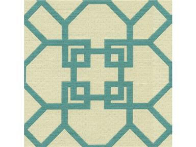
This is Kravet's Kapaa Akuatik outdoor fabric from Windsor Smith. 


I would pair this with:

Verdi - a green and create a green and turquoise scheme. 


Verdi No. 35

Or Piggy a stronger color than the fretwork for contrast. 


Piggy No. 49


This Moroccan inspired fabric by Schumacher called Nasrid Palace Mosaic showcases three vibrant colors. Any of these could be used as a wall color or even a white. 


The navy as an accent wall if you did not want the room to be too dark. 


Inka Dinka No.42

Or any of these 2 blue greens. 


Maddy Tingy No. 46


Piggy No. 49

Or even white for a crisp clean look. 


Snowball No. 2


Here is another fabric by Schumacher with a bold graphic pattern in bright colors and neutrals - Zenyatta Mondatta.  I love accenting bold patterns with neutrals instead of matching. Remember Rule #15 don't be a Miss Matchy - nothing could make a room more boring. 


A khaki and white room can be a great base for bold patterns and colors. 


Chase No. 63


Tooley Taupe No. 64


Shelby No. 8


Sidebar: I have told you about most of the names. There are 4 here that are new: Shelby - a client's Australian shepard dog.  Maddy Tingy - my nickname for Madison my dog. She is a mix of pit bull and Dalmatian, at least that is what the vet says. We think she looks more like a pointer. Chase  - my across the street neighbor's dog that we always rescue when he escapes. Tooly Taupe another nickname for Lulabelle. Tooly Lully! 

Tip: This is a green tip for St. Patrick's Day. You can save tons of $ by making your own hand soap. A regular soap costs $5.00 for 12 oz. This recipe makes 128 oz. for $3.50. Now that is saving. Check out this link for the recipe from: 


Happy Painting .....


Friday, March 16, 2012

Bridget Beari Color Rule #19


Bridget Beari Color Rule: 

#19

Black is Whack!

I mean "whack" in a good way. Every room needs a touch of black! Black is the great neutralizer. It can tone down bright colors, give a room that graphic edge, or be super sophisticated. 

High Gloss black walls: 

                                                           Photo from Architectural Digest


                        I love black window trim. It looks great here with the marble walls!


Here the bookcase and door trim are black. I love black with white surrounding it. The furniture, frames, upholstery are all in black with gold accents. It is very graphic and stunning. 


                                       These shiny black painted floors are gorgeous. 


                   Black is also the perfect balancer as in this Mary McDonald room. The black  
                                       upholstered pieces help tone down the strong yellow. 


Photo from House Beautiful 

This is a signature look of mine. I love to paint handrails black. Again the graphic nature of the black gloss paint really showcases the stairs. Most of the time the wood on the hand rail is not very pretty so this makes the rail so much better. This is the perfect application for Fine Paints of Europe - Hollandac Brilliant paint. It gives you that perfect shine. 


Don't you love the drama of these doors. I love white trim and black doors. Notice from Rule #18 the wall color is cream but the trim is whiter. Not stark white but creamier white to show off the doors. 


Even exterior shop fronts look more dramatic in black. 


Tip: 2 ways to save your brushes. 

Clean and hang upside down on a wire or rod. 


or wrap in craft paper and store. Both techniques keep the bristles from getting broken and bent. 


Don't forget we have Bridget Beari Quince and Rose candles for sale! Perfect for Spring! 


Happy Painting......


Thursday, March 15, 2012

Bridget Beari Color Rule #18


Bridget Beari Color Rule: 


#18

Create the Look with the Trim Color

I think that selecting a trim color for a room is one of the singular most important steps in creating the look. I am not a believer in matching a trim to the wall color i.e walls are blue so the trim needs a blue undertone. The trim is there to enhance the design whether that be the moldings, doorways or the walls. 

This rule may lead us back to the "Create a Mood" rule but this is where your paint colors can make or break your scheme. 

This is one of my favorite photos. The key to this color scheme is the white trim - no blue undertones or grey or cream just a brilliant white. Only this color will create the graphic edge this hallway needs. 


Photo from Traditional Home

If I am trying to pick a paint trim color for this room below, I would hesitate to make the trim bright white because it would loose its softness. I would choose, as they did here, a dirtier white in grey not cream. You want to enhance the pink walls not take away from them. 

The moldings are big and bold so you want them to stand out not blend into the walls. The draperies are also perfect with the wall color to give that elegance and feminine feeling. 


In contrast the malachite walls in the jewelry store below have a colored trim. How different the walls would look with a cream trim to match the background. The walls are gorgeous and are perfectly highlighted by the soft grey. Not a direct match but soft enough to fade away and dark enough to become one with the malachite walls. 


photo of Mish Jewelry Shop images by Salon Saloniste

Picking a trim color is key to enhancing your design scheme. Always think your look through to the end. What am I going for.... graphic, soft, bold. These adjectives will help you achieve your goals. 


               Tip: With all these beautiful rooms, we better keep our silver polished! Did you know that you can clean your silver with white toothpaste or baking soda. 


                       Happy Painting......


Wednesday, March 14, 2012

Bridget Beari Color Rule #17


Bridget Beari Color Rule: 


#17

Tone is the key when working with colors

I find that most colors can work together if you are aware of their tone. Tone is the intensity, brightness, or dullness of the color. I also call this the balance of color within the room. 

Below the tangerine, yellow and purple/pink rug are all strong colors. The red has more orange, the yellow has more green and the rug is a cooler tone. Two intense colors and one dull color and the key is the black. It tones the whole color scheme down a notch. 


Photo from Lounge

This picture reminds me of the quote: 

"Color is like spices. Just the right combination makes the perfect meal."

To capture this look try Bridget Beari Colors


Aspen No. 19


Shakin Jakin No. 24


Jinxy No. 40


Below is a room with cool tones. The print blue is intense, bolsters and lamp shades aqua more muted. All walls and trim are white but slightly different shades. The walls could easily have been a lighter aqua that the lamp shades. Again we see the black in the headboards to give the room some depth. 


Photo from Coconut

Try Bridget Beari Color: 

Big Boy Blue No. 50


Tip: March is great month to clean your ceiling fans before summer!

Happy Painting.....


Tuesday, March 13, 2012

Bridget Beari Color Rule #16


Bridget Beari Color Rule:


#16

Dark Colors Can Mask Architectural Details and Flaws

When you paint all aspects of a room with a dark color i.e. trim, walls, cabinetry, and ceiling you eliminate the architectural details.  This can create a unique look like this kitchen from Elle Decor. All the walls, cabinetry and trim blend together into one glossy jewel box. 


For a similar color try Bridget Beari Color

Piggy No. 49


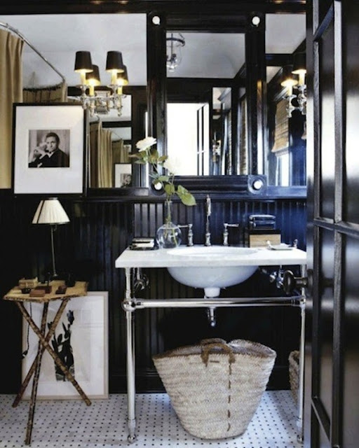
Notice how in this black bathroom from BH&G you can barely see the beadboard behind the sink. If the wood is not the best quality this is a tip that can hide many flaws. Having the dark wall color encompass the room makes all the fixtures, artwork and mirrors pop. It is a beautiful contrast! 


Tip: The best stain remover - Mix one part Dawn dishwashing liquid (the plain old blue kind), with two parts hydrogen peroxide , pour it directly on the stain, and watch it disappear. 
Thank you Glamour Magazine for that one. It works on almost any type of stain like wine, coffee, makeup etc. and on any fabric surface like clothes, tablecloths, rugs, etc. 


I love the red color of the wine spill. It looks like Shakin Jakin No. 24. 

Don't forget you can buy a Bridget Beari Color Fan Deck online at: Bridget Beari Colors


Happy Painting.....