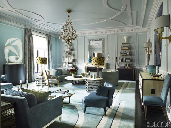
In this series I take rooms I love and break them down into key points that make the room work visually, artistically and architecturally.
This room is a Parisian apartment designed by interior designer Jean Louis Denoit. He is known for his classic style with a contemporary twist but what I love the most about JLD style is his fearless mixing of patterns and antiques.
This is why is this living room works so well:
photo - ELLE DECOR
1. Tones of blues
He starts this palette with blue tones, light to dark, robins egg to federal blue to black. Repeating the colors with just the right balance in the walls, carpet and ceiling. The stronger accents of black are in the etageres and sculpture bases to anchor the room. He adds gold to warm up the room but soft enough to continue his feminine palette. Just an odd touch of green to mix it up. Nothing is too perfect. He is also not afraid to mix the metals, silver mirror over the mantel with gold etageres, chandelier and sconces.
2. Scale
I love his use of over scaled ceiling patterns to match the rug pattern. All the architectural details were added to the room as the apartment was completely gutted. The large molding on the ceiling against the perfectly scaled picture molding on the walls and dental molding. A beautiful contrast. His furniture pieces move throughout the room from high - etageres and sculpture to mid range - lamps and art to low - seating. The seating seems to be all in the same plane. Curves of the sofas balanced against the curves of the chairs. Not to mention how this all relates to the ceiling and carpet curves - brilliant!
photo ELLE DECOR
3. Antiques with modern pieces
Although many of this pieces are high end, antiques or custom I was surprised to find some Arteriors, Osborne and Little, and Vaughan modern pieces added in. Things that we all can purchase but mixed in they look as expensive as the antiques. Original art and sculpture along side marble carved mantels and mid century lamps. It is a real art to be able to combine elements so beautifully.
4. Balancing act
The room is symmetrical with 2 lamps, 2 sofas, 2 tables but it does not feel stagnant. By using the 3 pieces of pottery on the back console your eye looks at the green pot then the strong blue small pillow that pulls your eye from the glass sculpture on the wall. The shapes repeat from the circular moldings on the wall to the sculpture over the console and the rectangular picture molding repeats on the sofa flat braid. Different scales but thoughtfully placed. I also love the white accents of trim on the sofa, crystals on the chandelier and moldings. It gives the room a beautiful ice palace effect.
photo ELLE DECOR
This is one of my favorite rooms of all time. I love studying the pieces- accessories, color, and scale.
Thank you for reading Anatomy of a Room! Leave me a comment and let me know what you think of Jean Louis Denoit's Parisian apartment.


