
A weekly blog series exploring different creatives' views on color and its use in interiors, art and design. We will dive deep into their obsessions with color. How and why they use color. You will get to know their stories and you may even gather some tips for using color in your own home. What is better than learning from the experts!
Our guest today is New York interior designer, blogger and product designer, Tamara Stephenson. She writes the popular design and lifestyle blog called Nest by Tamara and is also the co-owner of Root Cellar textiles which produces wallpapers and fabrics for the design trade. She describes her design aesthetic as " Sophisticated Cottage " A combination of modern furnishings, accessories and eclectic art with antiques and vintage finds. I love hearing how product designer's view color differently from interior designers. Do products tend toward color trends more than interiors? Let's find out from Tamara.

Susan Jamieson: What one color represents your design style?
Tamara Stephenson: Emerald Green
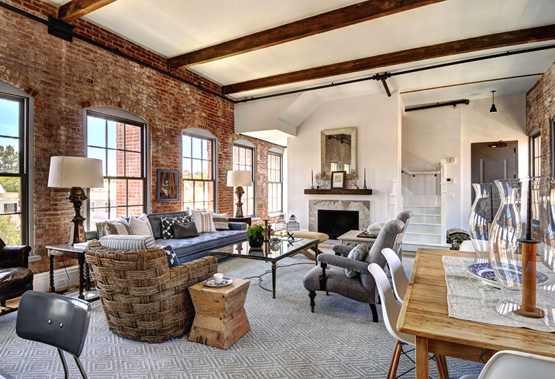
Jewel tones like emerald are a bold design statement, they are rich yet immediately create a positive energy in a home. I strongly believe in the medicinal value of color, and choosing the right hue for the space can transform the ambiance. I like to incorporate vibrant color in my designs-- sometimes as the primary color (painted walls), while other times as an accent color through the fabric choices or accessories. Emerald green is a perfect color for both uses. However, a home should not be one bright color after another, and nuanced and sophisticated use of color in a home can be tricky business, but when done right it defines the space. Combining neutrals with vibrant colors or soothing colors creates that balance. I painted my living room in New York City a rich green over 12 years and I have not tired of it! I finished off the room with lacquered white trim and fireplace and placed a black starburst over sized mirror over the fireplace. The juxtaposition of these neutrals allow the emerald color to shine. I use the mantel to display my American white pottery.
"A beautiful home starts with one that is rich in detail,
divulging the passions of the dwellers, bit by bit. Living purposefully, and taking notice
of your surroundings and feeling grateful for it.”
of your surroundings and feeling grateful for it.”
-Tamara Stephenson,
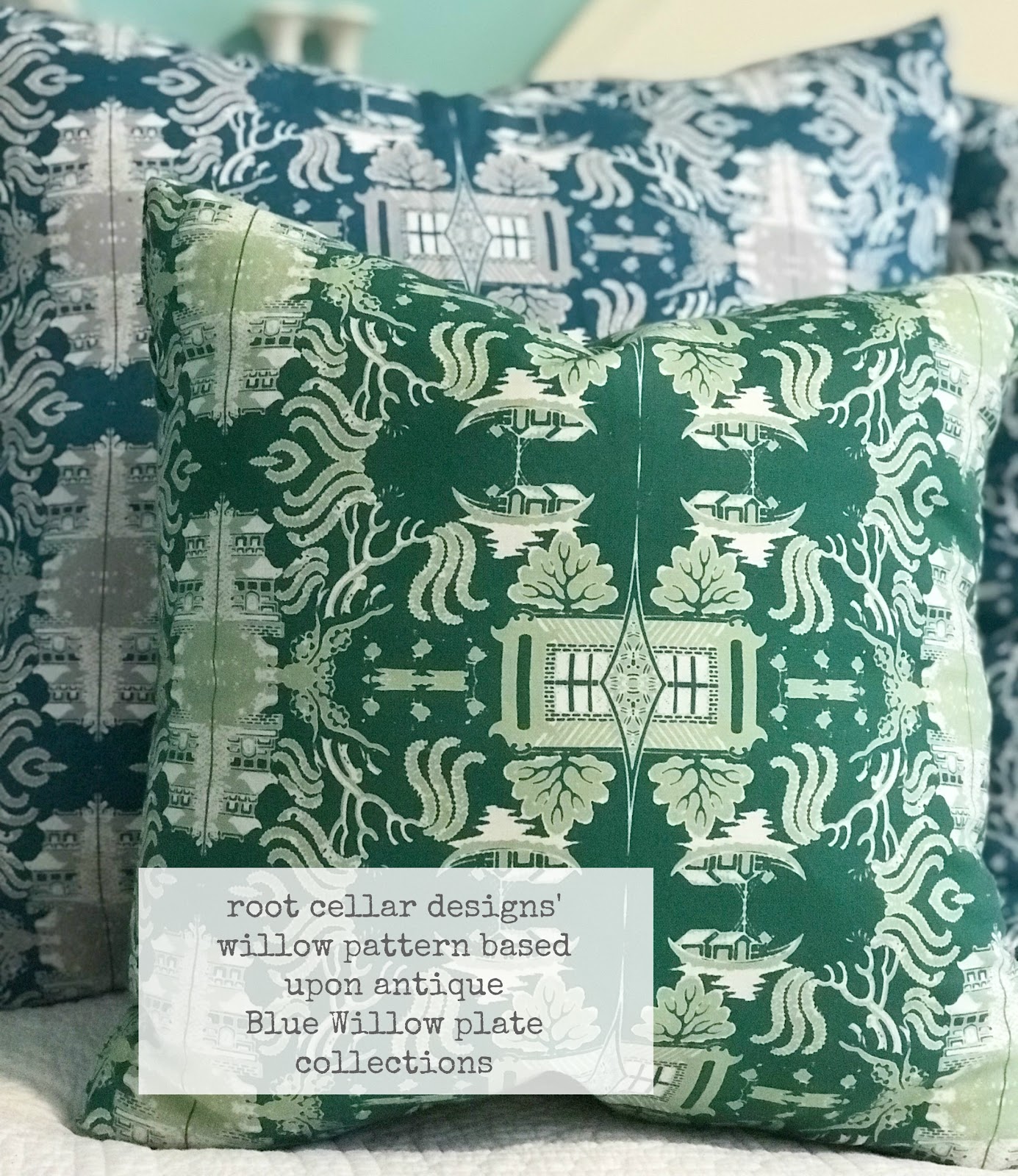
Emerald green pillow in root cellar designs’ willow pattern
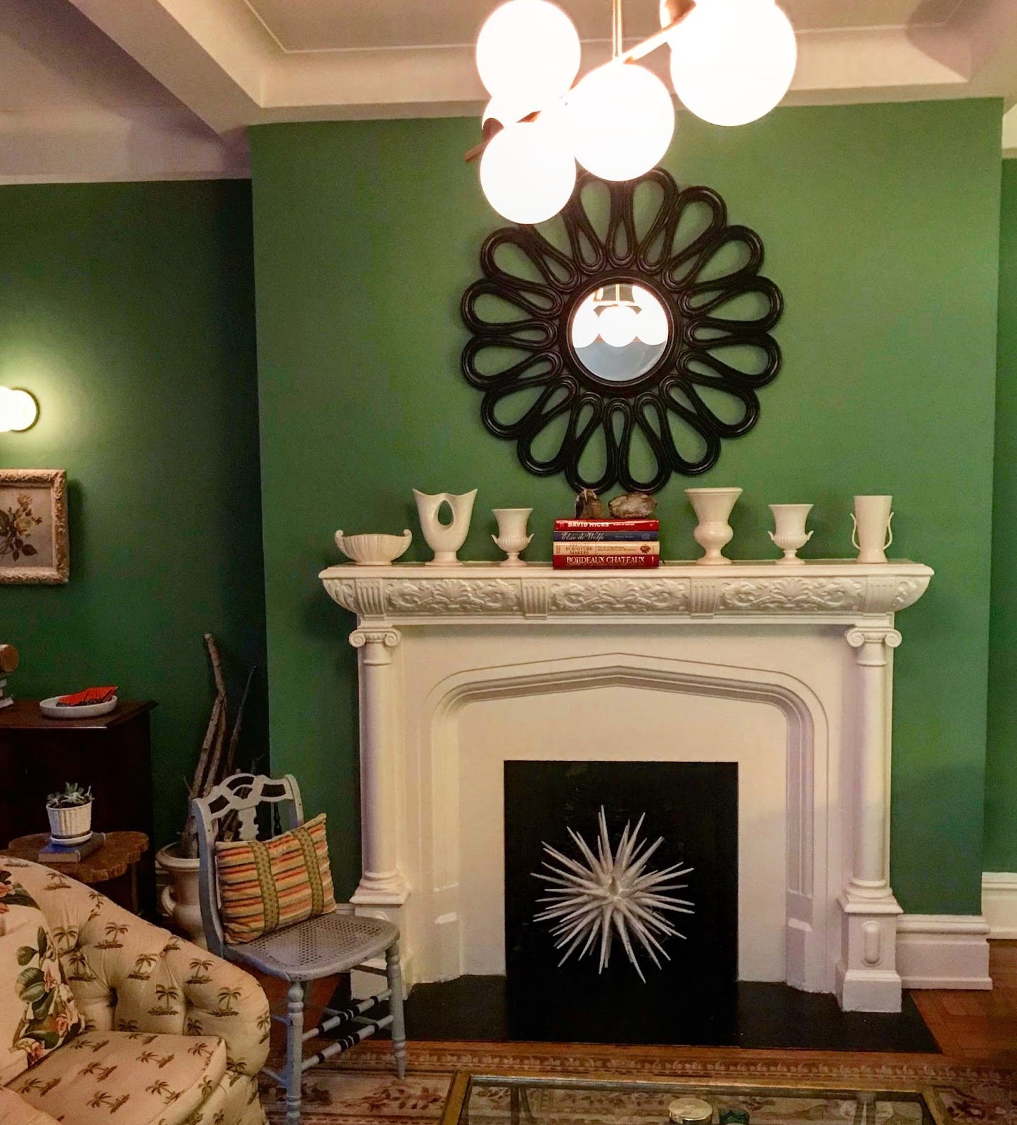
My emerald green painted living room in NYC
SJ: Do you use color as a dominant role in your designs or as an accent?
TS: Definitely color plays a dominant role in all my designs from my fabric and wallpaper designs to my interior design. It sets the stage for the rest of the composition, and I often start with the palette first then we go from there. Color brings the design to light and has a huge impact on the overall perspective.
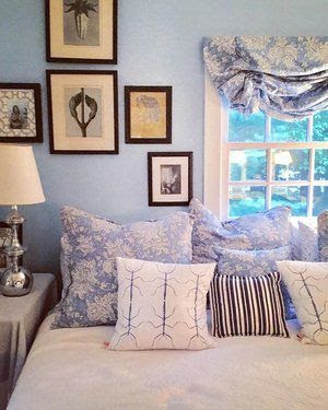
East Hampton beach-house master bedroom
the paint color is the same hue as the blue and white toile- so in this case we used tone
on tone, all one color
on tone, all one color
SJ: How do you feel about matching colors in a room?
TS:I’m generally not into matching colors, but instead I layer (sometimes varying versions of the same hue while other times contrasting colors) I like unexpected pops of color and unusual pairings. The juxtaposition of a grey painted wall with pops of red or bursts of cobalt allows the eye the right amount of movement between color and neutrality. The one time I like matching colors is occasionally I will decorate an all-one color palette in a bedroom, like my master bedroom in our beach house in East Hampton which is all the same cerulean blue (painted on the walls, the same color on the blue and white toile fabric which we upholstered on the bed, bed skirt, pillows, settee and curtains). This tone on tone of the same color in this instance gives a soothing, relaxing feel to this cottage. When choosing color, the use of the space is an important factor. For instance, for bedrooms I like to use calming or cocooning colors that encourage sleep and calm, a safe haven-- it can be dark and moody or light and soothing while a living room and public space, I opt for more energetic palettes- hues that encourage socializing, thought or creativity.
" A happy home starts with the homeowners taking notice and enjoying these details everyday-- setting a pretty table, putting out fresh flowers, arranging and editing small collections and vignettes."
- Tamara Stephenson
- Tamara Stephenson
SJ: What color represents your personality?
TS: Tiffany Blue-- it’s a happy color and at once bold and versatile as well as
soothing and nurturing. It’s not typical and it’s stylish and sophisticated yet it
“plays nicely” with other palettes. It feels of many time periods, yet it’s fresh and
modern as well. If I were a color, I’d definitely be Tiffany Blue. It’s the paint color
in my Master bedroom in New York City, and when I enter the bedroom, it
immediately makes me happy. I have used it in many client’s homes. It works equally well with white, grey, navy, brown or black. It feels comfortable in an urban, country or beach setting, and that versatility is just like me!
SJ: What color comes to mind when you talk about:
Your favorite city-- Black
My home town New York City-- when I think of New York and color, I immediately
think of the sophisticated little black dress and how chic that is, a staple in every
stylish woman’s wardrobe. I love black cabinetry in a home, either painted
bookshelves flanking a fireplace or matte painted kitchen cabinets. Who doesn’t
love a hexagon black and white tiled bathroom floor? It feels very quintessentially
old world New York.
The house you grew up in: Seagull Grey
We moved several times growing up -- and we lived in unique places from a historic
sea captain’s home in Port Jefferson, Long Island overlooking the harbor to a
converted, historic barn on a mountain top in Vermont. My mother was an artist
and painter and loved color, and she used grey often as a backdrop to offset her
fastidious palette. In our sea captain’s home, she painted the large, rambling
kitchen wainscoting a gull grey then the wall above it and the walk in food pantry
a buttery yellow. Even today, I enjoy using grey and it reminds me of my
childhood. I have used some form of grey in almost every home I’ve decorated.
In a recent Park Avenue apartment I painted the walls three different shades of
grey in three adjoining rooms from darker to light beginning with the study a
lacquered smoky grey, then ending with a pale grey in the living room...it created
an ombre effect and was stunning. My dining room/kitchen in East Hampton
(where we have vaulted ceilings) I painted a medium gull grey above the
wainscoting and the wainscoting a fresh white below. Here the grey and white are
the perfect backdrop for pops of color and the white wainscoting below keeps it
fresh and perfect for a beach house.
Last fabulous dinner you had-- predominant color, Red.
We hosted a dinner party in summer, and whipped up a fruity sangria, prepared
enchiladas and served fire engine hot fresh salsa, set the table with a red white and
blue with antique red lanterns lining the table, and blue hydrangeas picked from
my garden
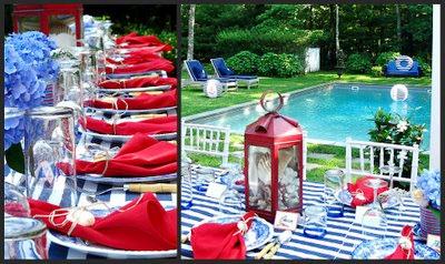
Al fresco dinner party with blues, white and lots of red
Your favorite flower-- I love so many flowers but I have a special place in my heart
for lilacs, so lavender. Lilacs bloom for a short time in May and they are very
fragrant-- reminding me of the tree growing out my bedroom window in Vermont.
for lilacs, so lavender. Lilacs bloom for a short time in May and they are very
fragrant-- reminding me of the tree growing out my bedroom window in Vermont.
Your favorite season-- summer, Cerulean Blue
The color of the ocean, swimming pools and the big summer sky. It reminds me of East Hampton, my happy place in the world.
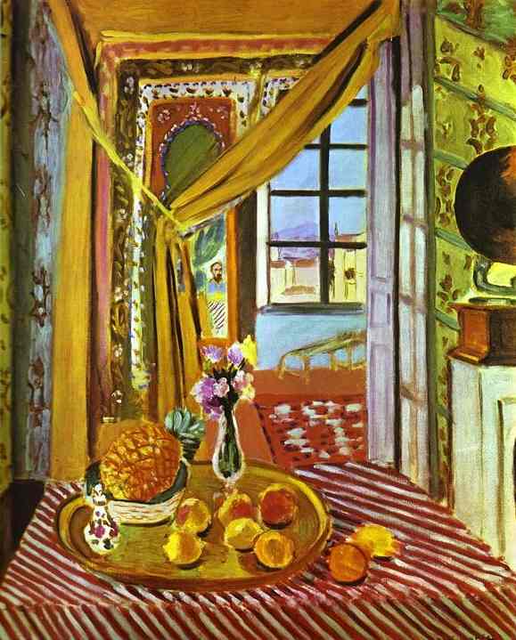
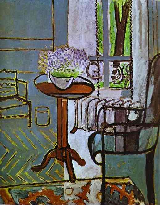
Your favorite art-- I love Henri Matisse
He is a master colorist and painted many interiors throughout his life. My two
favorite-- interiors with phonograph (left); the window(right)
favorite-- interiors with phonograph (left); the window(right)
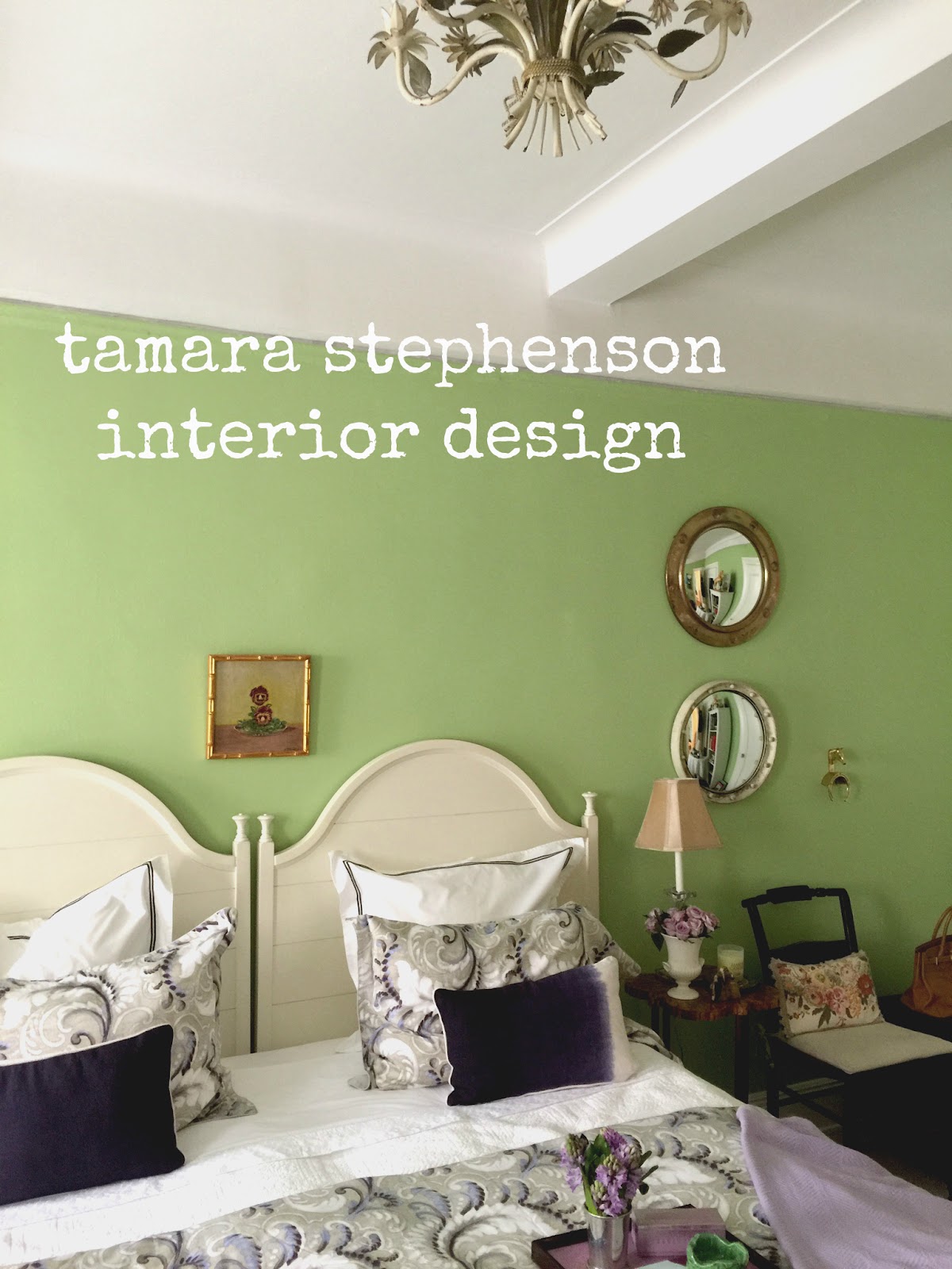
Your favorite room in a home-- a Minty Green guest bedroom.
I find myself gravitating to the guest bedroom in a home because I enjoy hosting guests myself. Clients often give a lot of thought to making guests feel welcome, so it is sometimes the most well designed room in a home. It is great fun to pack this space with all the accouterments necessary for a fantastic stay away from home, and I love it that the guest bedroom can be less cluttered than other rooms, it is a fantasy space of sorts. I like using minty green, and it is a soothing yet invigorating and inspiring color.
Your favorite beauty product-- lipstick, Pale Pink

Your favorite article of clothing-- my Kelly Green fall coat. It just brightens everything up.
SJ: Name a color you never use?
TS: I love yellows from pale to rich jewel-toned yellows but I’m not a huge fan of the muddy ochre yellow (for interiors). In general, I like clear colors in a home.
SJ: Name a color you use frequently?
TS: All variations of BLUE from rich and deep indigo to pale sky blue. To me, blue is the happiest of colors and instantly makes me want to spend time in a room. I love mixing all the shades of blue together.
Mixing blues from navy to sky together in
this industrial space in Sag Harbor.
Blue floral Farrow & Ball wallpaper set the tone for my dining room design
And the abstract painting by Jerry Teters added even more blue interest
SJ: If you could pick a name for a color what would it be?
TS: The most fun part of designing products-- wallpaper and fabric-- is naming them creative titles. These are a few of the new color names we’ve named our latest textile collections-- Summer Glass, Millennial Pink; Prussian, Ocean, Poire, Dark Sky, Stone, Putty, Summer Blues, Minty, Noir, Sky, Pinkish, Saddle, Peacock, Sage, Wheat
SJ: Do you have a pet? What color reminds you of him/her? Do you have a nickname for this pet?
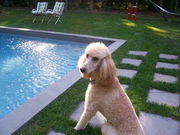
Our Standard Poodle Bridget (bridge-y) by the pool
TS: When I think of Bridget I think of pool blue and grass green because she loved to lounge for hours pool-side at our house in East Hampton, and she especially loved to roll in the grass when she was most happy (which was every day). She was seventeen years old, and sadly passed away this winter of old age.
SJ: What is the now Neutral?
TS: Navy blue.
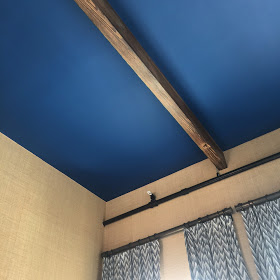
Navy is like a neutral because it can be combined with almost any color and color combination. I have painted two teen bedroom rooms this color this past year. It feels grown up and sophisticated, regal yet edgy. It can work well with a bright white for simplicity or a burnt orange and lighter blues for a bit more layering. Here it is paired with seagrass wall covering. I painted this guest bedroom ceiling with double height ceilings a blueberry/navy and it immediately brought a bit of cozy to the space.
SJ: What is your prediction for the next big color trend?
TS:If home design follows fashion (as it often does), Lavender. This season I am loving all the effervescent lavender in fashion, and it is a happy/joyful color and now with all the jewel-toned violet that is popular in interior design, I predict the lavender cousin to be making a comeback in homes to pair it with the brighter violet. It’s makes everyone look beautiful to boot!
SJ: What are the best color combinations?
TS: So many, and it’s hard to choose...but my favorites are black and blue (edgy), blue and green (think sky and grass/ocean and forest), pink and green (preppy); blue and white (classic); pink and brown (handsome), grey and blue (regal), grey and red (fun), blue and orange (French)....I could go on and on.

SJ: Best advice when it comes to picking paint colors?
TS: Don’t pick what is trending or popular, pick what you love, what brings you joy and colors you want to live with for a long time.
Tamara Matthews-Stephenson
Interior designer, author Nest by Tamara blog,
co-owner/creative director wallpaper & textile company,
Instagram: http://instagram.com/tamarastephenson
Twitter: http://twitter.com/nestnestnest
Facebook: http://facebook.com/rootcellardesigns
Websites: http://nestbytamara.com
________________________________________________________________


3 comments:
Great informational article! I have to thank you for making this available. I like your point of view and how engaging your article is written. emerald omegle
If you observe any violation while using an emerald chat app then you have an option to simply block a person. Apart from this, if you receive an unwanted thing or any issue in the app then you can contact moderators. They are always there for you to resolve your queries or problems.
Nice Post Visit Us Interior painting Port Moody
Post a Comment