
A weekly blog series exploring different creatives view on color and its use in interiors, art and design. We will dive deep into their obsessions with color. How and why they use color. You will get to know their stories and you may even gather some tips for using color in your own home. What is better than learning from the experts!
_______________________________________________________________
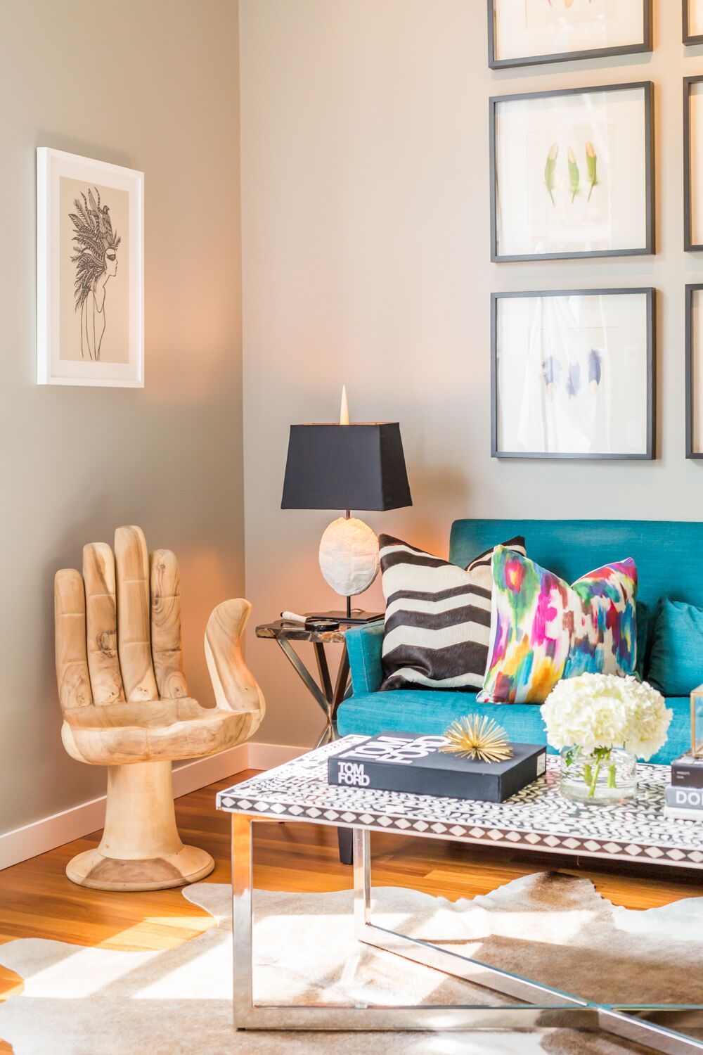
Hue Are You?
Designer Spotlight: Pulp Design Studios
The design duo of Beth Dotolo of Seattle and Carolina Gentry of Dallas make up the design team Pulp Design Studios, interior designers and products designers. Known for their lively modern interiors and their "Splendid Living" approach, these girls are rocking the interior design world from Traditional Home showhouse rooms to their Kismet bar products,hardware, and throws. I can't wait to learn more about color and their design style so here we go .....

Susan Jamieson: What One Color Represents Your Design Style?
Beth Dotolo: This is impossible to answer, but if I had to give one I would say conceptually, the color purple because it defines creativity, although we rarely use purples in our designs.
Carolina Gentry: It is impossible to have one! Our design style is represented by an array of colors.

" WE ARE NEVER NOT DREAMING UP DESIGNS TO WOW OUR CLIENTS"
- Beth Dotolo

SJ: Do You Use Color as a Dominant Role in your Designs or as Accents?
BD: I like to use one color as a neutral base and fill in with accents for our clients. Color does guide many of our designs, but more as an accent and not a scheme, which keeps spaces flexible and adaptable.
CG: I like using color as an accent in textiles for our clients. Color trends will come and go, so using it as an accent is a great way to be on trend without being married to any one style.
SJ: How Do You Feel about Matching Colors in a Room?
BD: I typically like our designs to form organically and find that color schemes feel too contrived.
CG: While it's not my personal style, it has it's place depending on the client and the project. If it's a nursery, match a way!

SJ: What Color Represents Your Personality?
BD: I would be a rainbow of jewel tones -- something vibrant, yet calm!
CG: I would say my personality is represented by tonal colors because they are the most my style which is a little unexpected because people say I'm very energetic.
SJ: What Color Comes to Mind When You Talk About:
Favorite City .....
BD: New York is red because it's so full of energy and never sleeps. The Big Apple!
CG: San Miguel De Allende. I think fuchsia is perfect to represent all of the beautiful Bougainvilleas that cascade on the buildings.
The House You Grew Up In .....
BD: The house I grew up in was brown, which feels like the perfect color to represent the old reliability of my soul.
CG: My parents are avid art collectors so the house I grew up in would be a color wheel. Maybe this is why I can never pick just one color!

"NO SPACE IS COMPLETE WITHOUT ART!"
- Carolina Gentry
The Last Fabulous Dinner You Had ......
BD: The last fabulous dinner I had was at the top of the Rowan hotel in Palm Springs with Carolina, Bobby Berk, and his wonderful partner Dewy, and Catherine Sheppard. I think of yellow because it's the color of friendship and happiness.
CG: We had an amazing dinner during Modernism Week with Beth and our friends Bobby Berk and Catherine Sheppard, which I’d give a caramel color to represent the moody dining space at the Rowan!

Your Favorite Flower ....
BD: Flora Green for a succulent!
CG: Rusty red for a protea -- I love that they’re structural and simple.

Your Favorite Season ....
BD: Olive Green for fall - the air is crisp and my birthday is coming!
CG: I think of white for spring because everything is brighter and I get excited about being able to wear white again
Your Favorite Piece of Art ....
BD: My favorite piece is the first original that I bought as an adult. It's this beautiful charcoal and oil painting, so I think of black and white.

CG: I can’t pick a single piece, but one that comes to mind is this abstract sketch and watercolor piece that I got at Alfies Antique Market in London. There’s a crazy backstory to this particular piece, but I think of cobalt blue like the watercolor.

Your Favorite Room in A Home ....
BD: The living room is my favorite room in a home because it's the place that family and loved ones come together to enjoy one another. I think of salmon because it represents joy and contentment.
CG: The kitchen is definitely my favorite room. I spend a lot of time cooking and it’s truly the heart of the home. I think of white because you just can’t beat fresh white walls!

Your Favorite Beauty Product ....
BD: I think of blue to represent any hydrating or overnight mask. You have to replenish with all the travel we do for Pulp!
CG: Blush for the La Lotion Essence de Rose by Dior… it’s amazing!
Your Favorite Article of Clothing ...
BD: My favorite piece in my closet right now is a pair of black Gucci loafers. Black is classic and can elevate any outfit and feels like the prefect color for investing in staple pieces, just as we do for clients!
CG: Army green for any kind of lightweight jacket!

SJ: Name a Color You Never Use?
BD: Never say never , but we rarely use yellow.
CG: There isn’t any color that I would never use, but people tend to have a hard time with chartreuse. However, every color has its place when used in the right way!
SJ: Name a Color You Use Frequently?
BD: We've been using touches of royal blue a lot recently!
CG: Navy!

SJ: If You Could Pick a Name for a Color What Would It Be?
BD: Kismet - the name seems to be showing up in our lives and new collections a ton lately.
CG: Cielo Blue, which means sky in Spanish!
SJ: Do You Have a Pet? What Color Reminds you of Him/Her? Do you Have a Nickname for this Pet?
BD: We have a cat named Boris who is very full of personality. His name really says it all. I think of jade green because of his eyes.

CG: A Frenchie named Ripsie! I think of black and white because that’s what she is!

SJ: What is the now Neutral?
BD: Camel
CG: A moody blue or tan!

SJ: What is Your Prediction of the Next Big Color Trends?
BD: Lapis Blue has been huge color trend that is here to stay for awhile.
CG: A broad spectrum of blues, from moody to pale!

SJ: What are the Best Color Combinations?
BD: I have been so into cobalt blue, black and tan and anything fuschia grounded by a good neutral.
CG: Any combination of neutrals always look amazing together. I also love burnt orange and indigo, and olive and blush.

SJ: Best Advice When It Comes to Picking Colors?
BD: We do a lot of neutral paints accented with statement wallcoverings for our clients. Go with a rich neutral to ground your space as trends change. They're the easiest to work around, but sometimes the hardest to select because all of the nuances in shades.
CG: We always pick paint colors for our clients in the actual space we will be using it. Lighting changes everything so it’s essential you see the color under the room’s natural light to get an idea of what it will look like.

" DESIGN IS ABOUT EXPERIENCE"
- Pulp Design Studios
________________________________________________________________

No comments:
Post a Comment